Data Visualization Portfolio
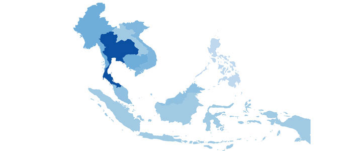
Hiv in South East Asia
A portrait of the Hiv epidemics in the region by country. In D3.
View Project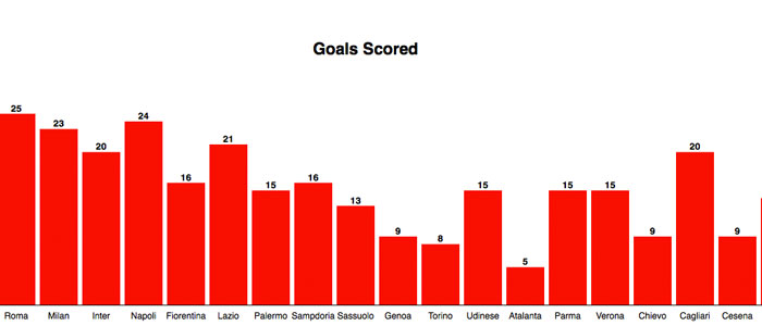
Serie A in a nutshell
Here is a data-portrait of the Italian Soccer League, "Serie A" for the season 2014-2015. In D3.
View Project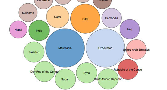
Slavery Top 20
The 20 countries with the highest estimated proportion of slaves among their pupulation account for 20.221.900 modern slaves, more than half of the total amount of modern slaves in the World. Data from The Global Slavery Index. In D3.
View Project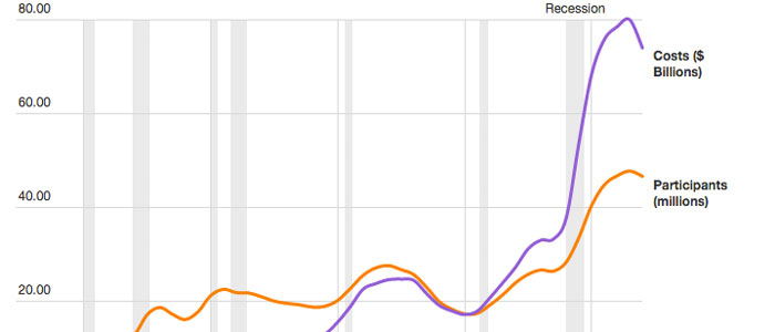
Food Stamp Nation
Participation in the federal Supplemental Assistance Program has grown in recent years. Done with Datawrapper.
View Project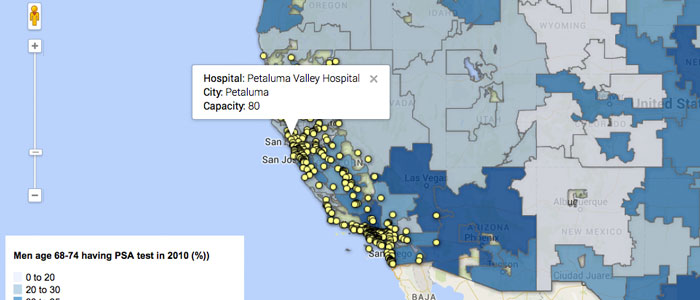
Prostate Cancer Prevention in California
A map that shows the percentage of men between 68 and 74 years of age that got a PSA test in 2010. Experimenting with Google Fusion Tables
View Project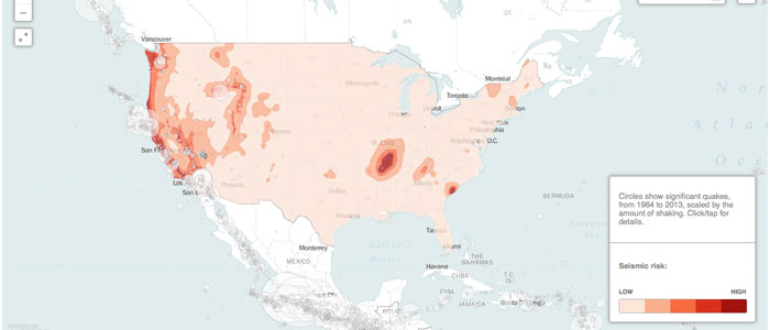
Seismic risk in the continental USA
A map that shows seismic risk in the continental USA and all significant quakes, from 1964 to 2013, scaled by the amount of shaking. Experimenting with Carto DB
View Project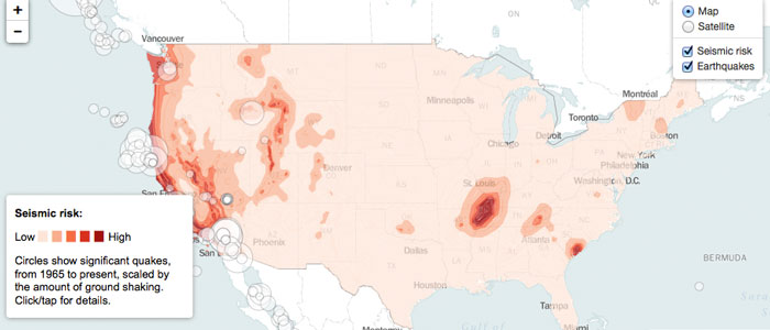
Seismic risk with Leaflet
This is exactly the same map as above. This time, tough, I've used Leaflet
View Project